Design Showcase
Re-imagining your brand identity can propel you in the direction you were destined to navigate.
While it is always exciting working with new clients to conceptualise their brand identity, we love being given the opportunity to rebrand the visual identity of our long-standing, valued clients as we journey with them through the progressions of their businesses.
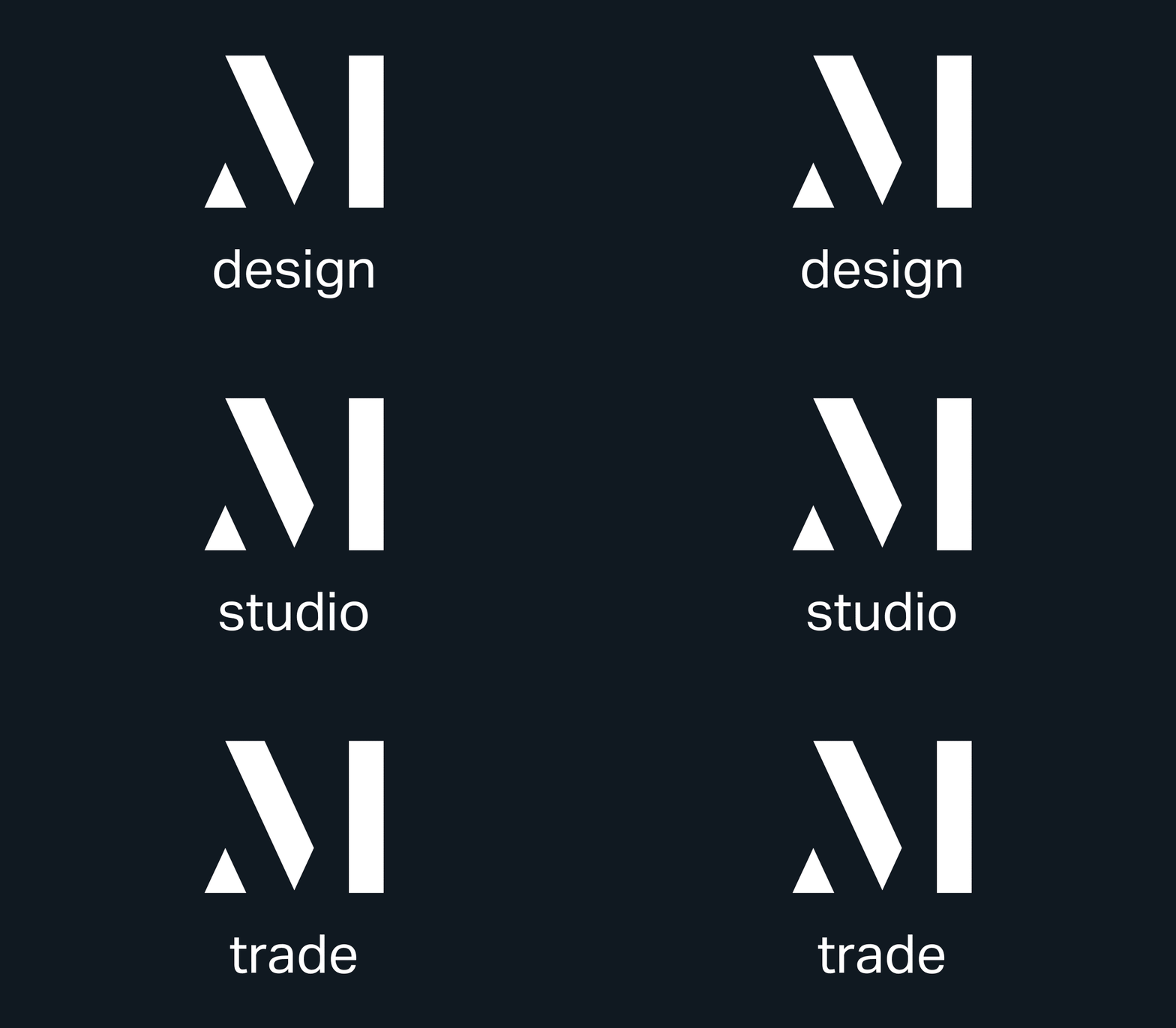
M. Design / Studio / Trade
After one of our existing clients went through a restructuring of their business, we were tasked with coming up with a clean brand identity which would clearly communicate this evolution. This new direction and vision was inspired by revisiting the Brand Vision and DNA Process.
As archaeologists of interior architecture and decor, M & M Design’s core purpose is to conceive and create spaces that combine discretion with timeless design. For their identity we chose to focus on three words: Simple. Bold. Beautiful.
With expansion to three distinct arms to the business - retail, interior design consulting, and bespoke products, we came up with three umbrella identities: M Trade, M Studio, and M Design.
For the brand identity and icon design, we delivered to the client a Brand Identity Guideline for both the Design and Trade offering, Corporate Stationery Design, Email Signature development Signage Design and Packaging Design.
To reimagine the brand identity, we chose to go with a clean, classic colour palette with Black (Sophistication, Elegance, and Authority) and White (Clarity, Cleanliness, and Simplicity). We love letterform logos as these design types are the more minimalist versions of monograms (letter logos). By selecting letterforms, you decisively set your brand apart. Using only one letter of the brand name, typically the initial letter, letterform logos need to be bold and eye-catching to make your brand more identifiable.
Due to their minimalistic anatomy, letter logos are easily scalable and responsible. They work perfectly in any space - from digital scenarios on the web or social media, to printed materials. They are easy to identify yet still distinctly modern, as opposed to monograms that often have a heritage, legacy feel. Because of its simplicity, the letterform logo has a timeless edge and carries an air of quiet confidence.
The progressive M icon has a classic nuance, expressed through primary geometric shapes. Consisting of three parts, each drawing on the brand values of courage, consistency and integrity, the brand icon has structure and strength. The triangle is representative of discretion, timelessness and connection. Although abstract in form, the M is recognisable – speaking to the discerning eye. Utilising free space, the elements work together to create a multi-dimensional whole.
We are so excited with the results and can’t wait to see them in application. If you are looking at elevating your brand, we would love to partner with you.


